

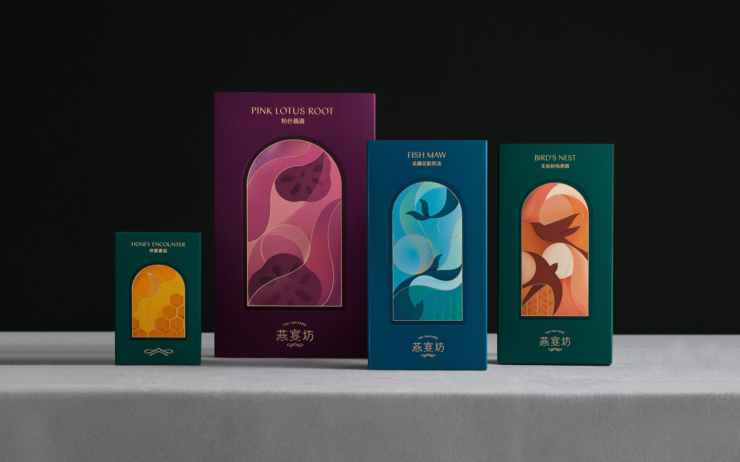
YAN YAN FANG Rebranding
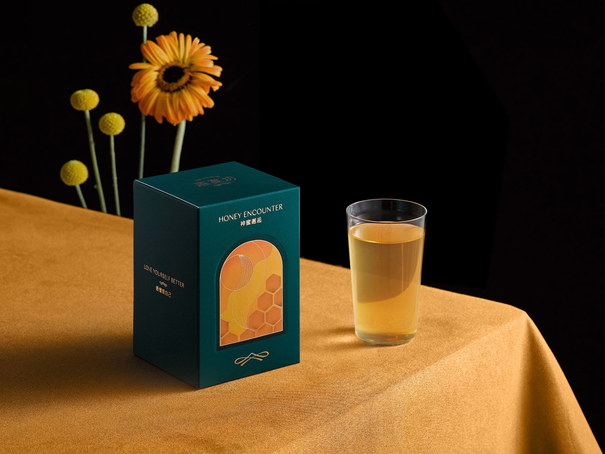
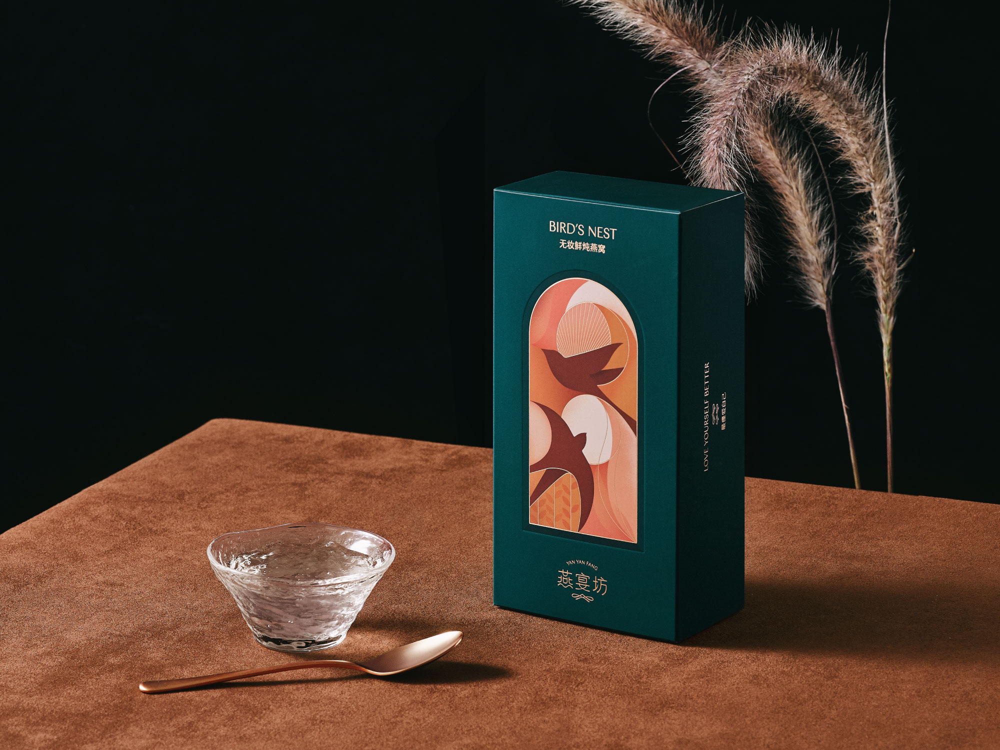
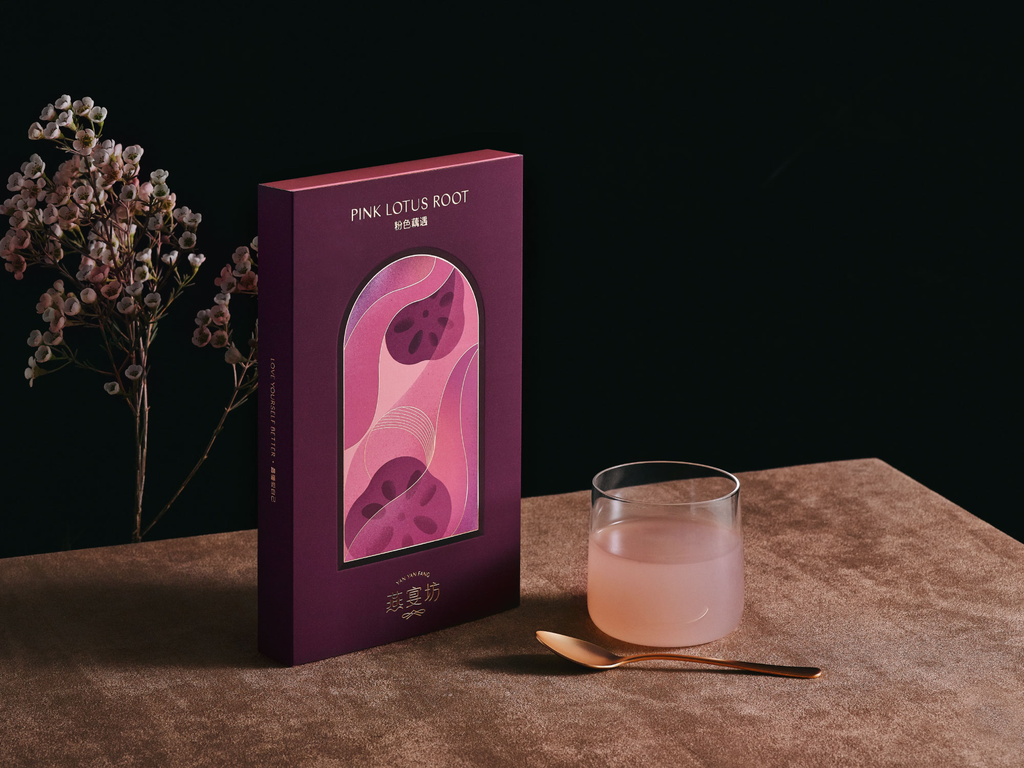
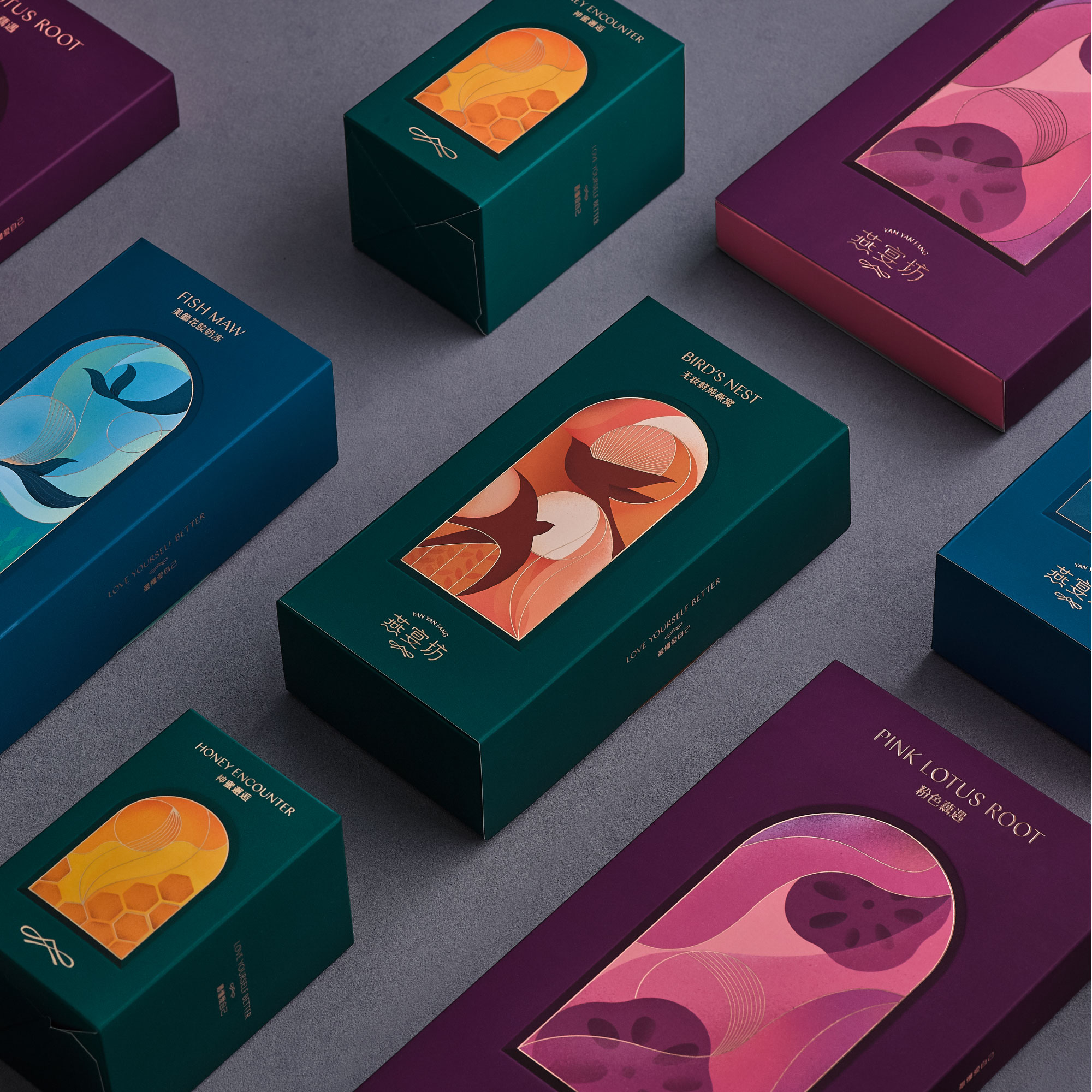
A system of rebranded packaging designed for edible birds’ nest brand Yanyan Fang based in Jiangxi, China. With the saturation of the traditional birds’ nest in China’s market, most products deliver an old-fashioned feeling to the younger generations. We were challenged to innovate and create new connections with the young market by designing a refreshed image for the brand.
We designed a collection of packaging with an elegant color palette and illustrations in order to communicate the brand’s values with modern language. The rebranding aims to reposition the brand and attract the eyes of the young middle class group.
為中國江西燕窩品牌 — 燕宴坊,重新設計產品包裝;因應燕窩產品在國內市場面臨非常飽和的情況,傳統燕窩產品與年輕消費群產生距離感,燕宴坊希望為即食產品重新建立形象,開拓年輕消費市場。
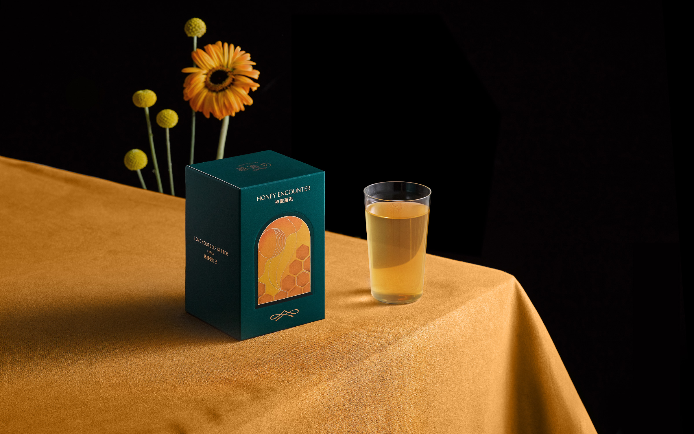
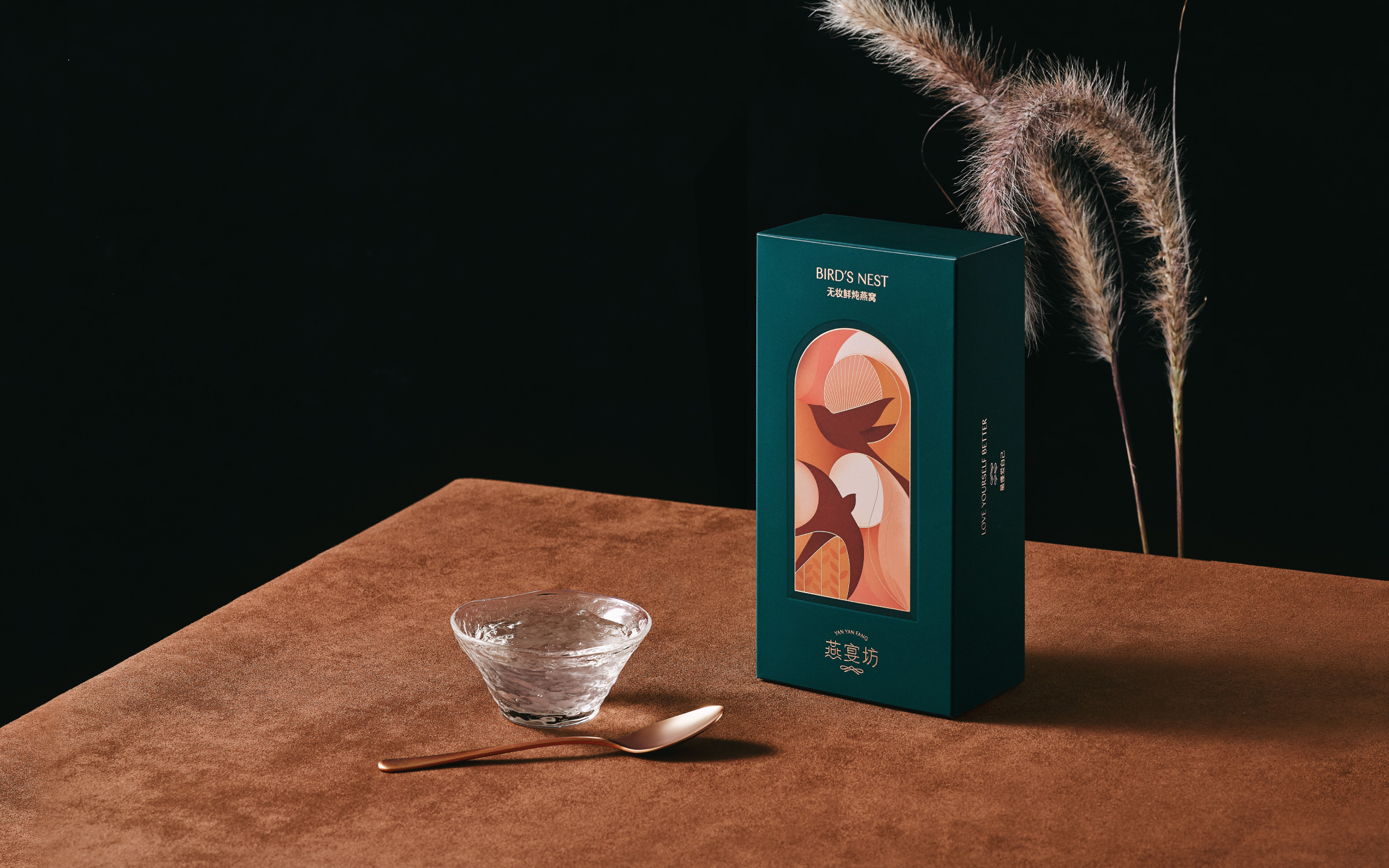
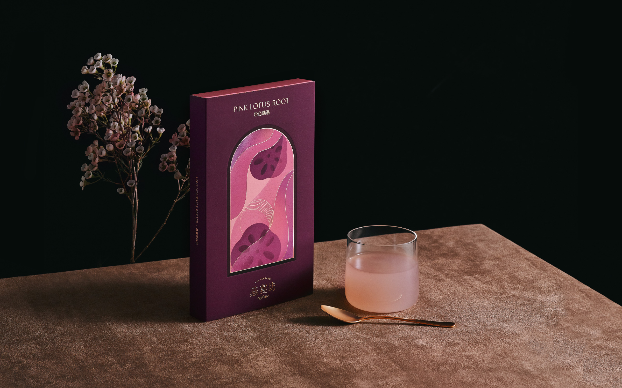

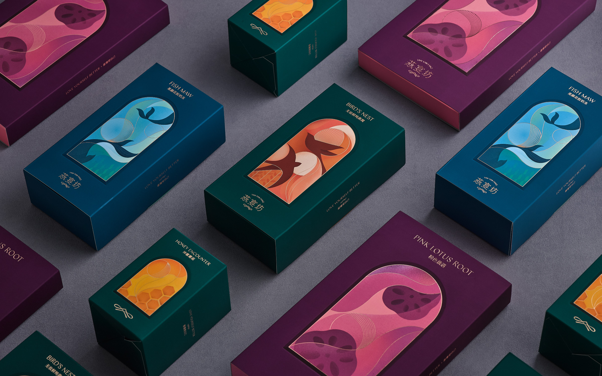
Photography by Andrew Kan

YAN YAN FANG Rebranding
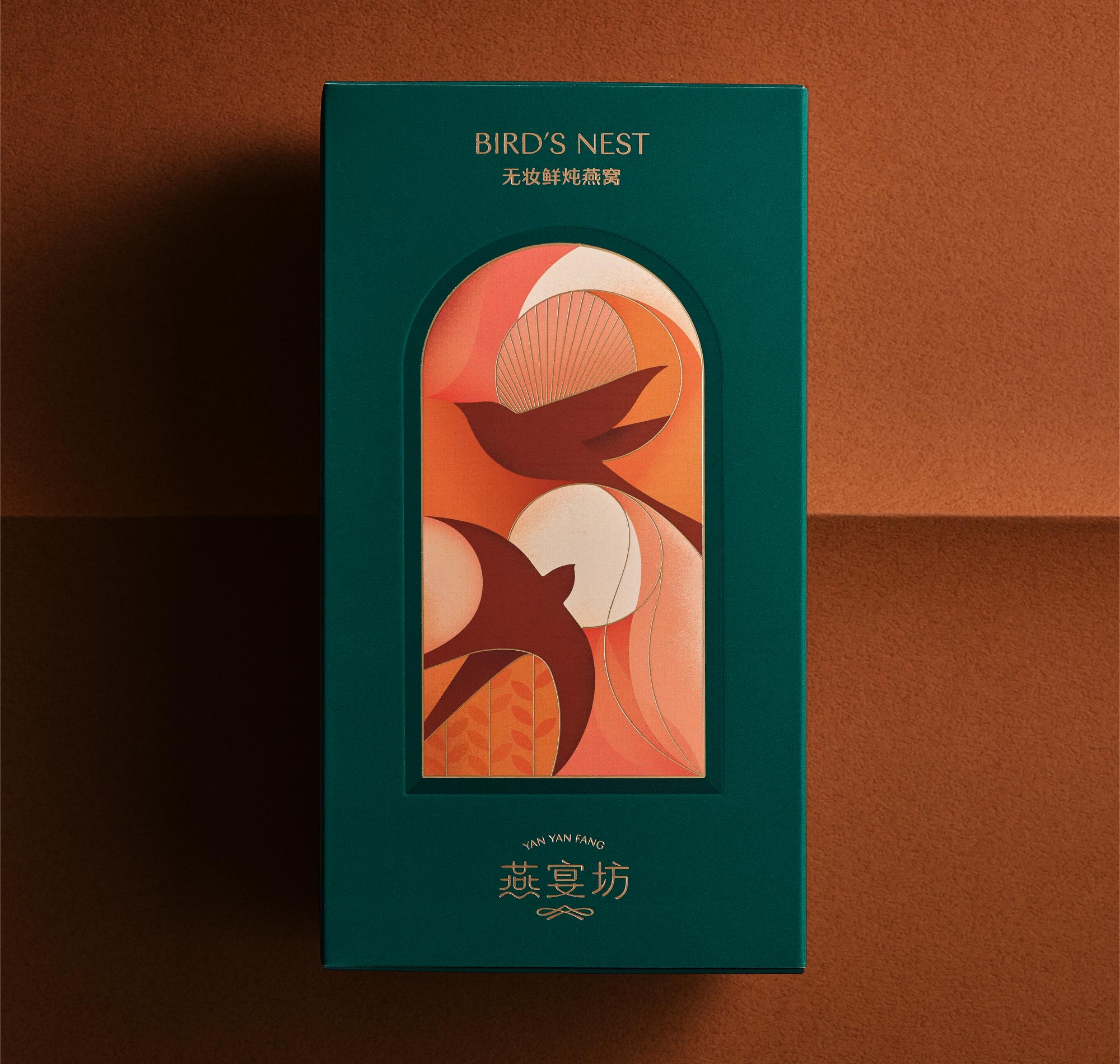
A system of rebranded packaging designed for edible birds’ nest brand Yanyan Fang based in Jiangxi, China. With the saturation of the traditional birds’ nest in China’s market, most products deliver an old-fashioned feeling to the younger generations. We were challenged to innovate and create new connections with the young market by designing a refreshed image for the brand.
We designed a collection of packaging with an elegant color palette and illustrations in order to communicate the brand’s values with modern language. The rebranding aims to reposition the brand and attract the eyes of the young middle class group.
為中國江西燕窩品牌 — 燕宴坊,重新設計產品包裝;因應燕窩產品在國內市場面臨非常飽和的情況,傳統燕窩產品與年輕消費群產生距離感,燕宴坊希望為即食產品重新建立形象,開拓年輕消費市場。
