


INÁGE Branding
Type
Art Direction
Brand identity
Packaging
Photography
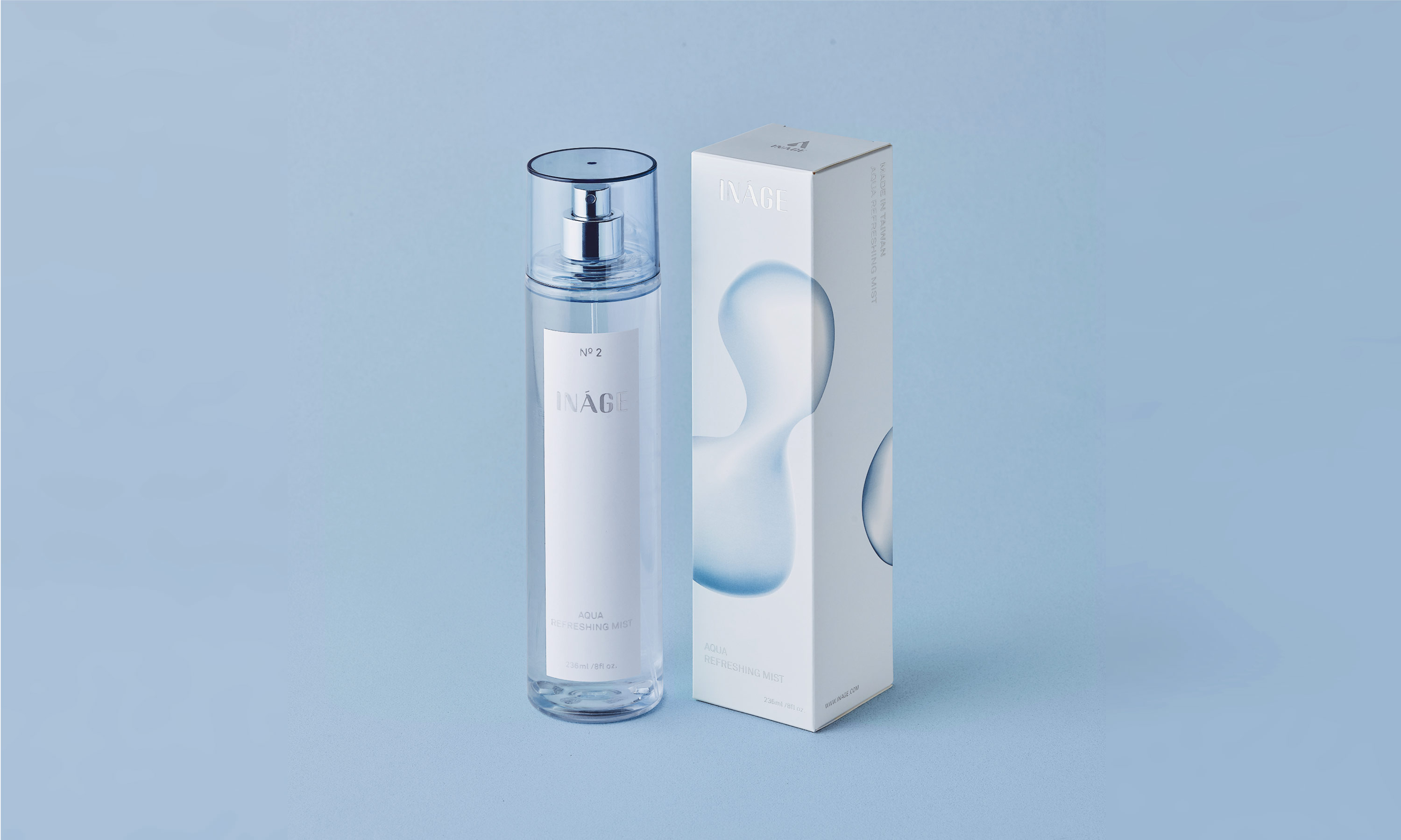
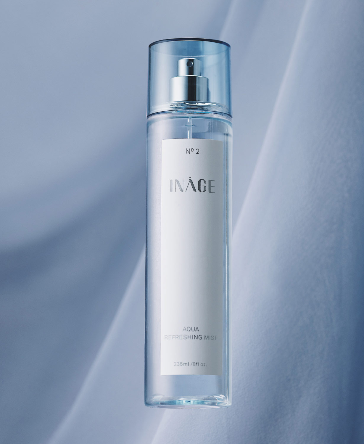
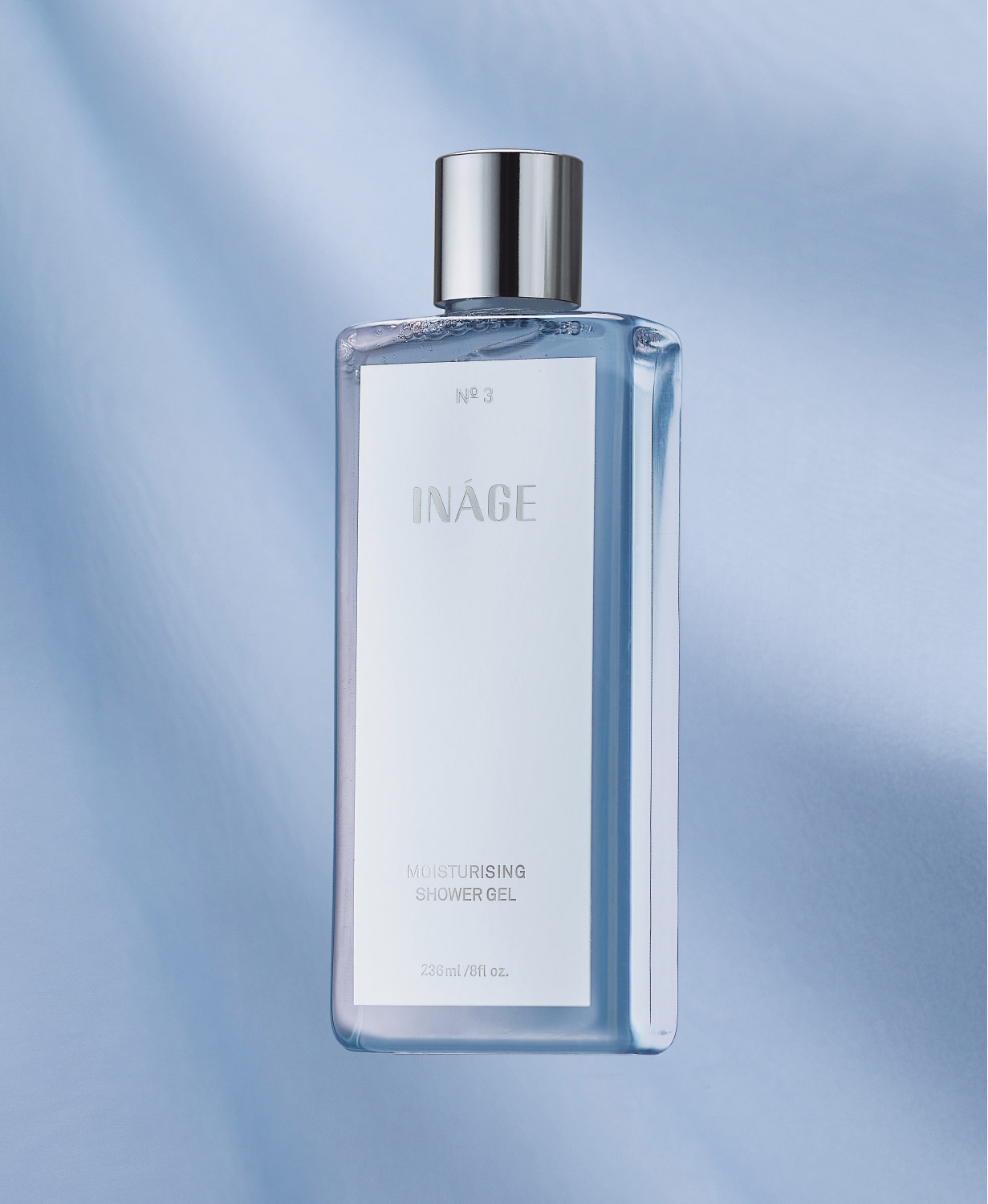
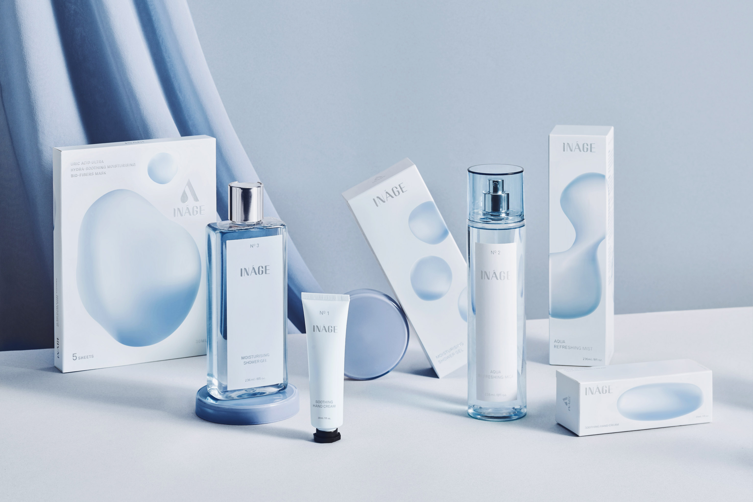
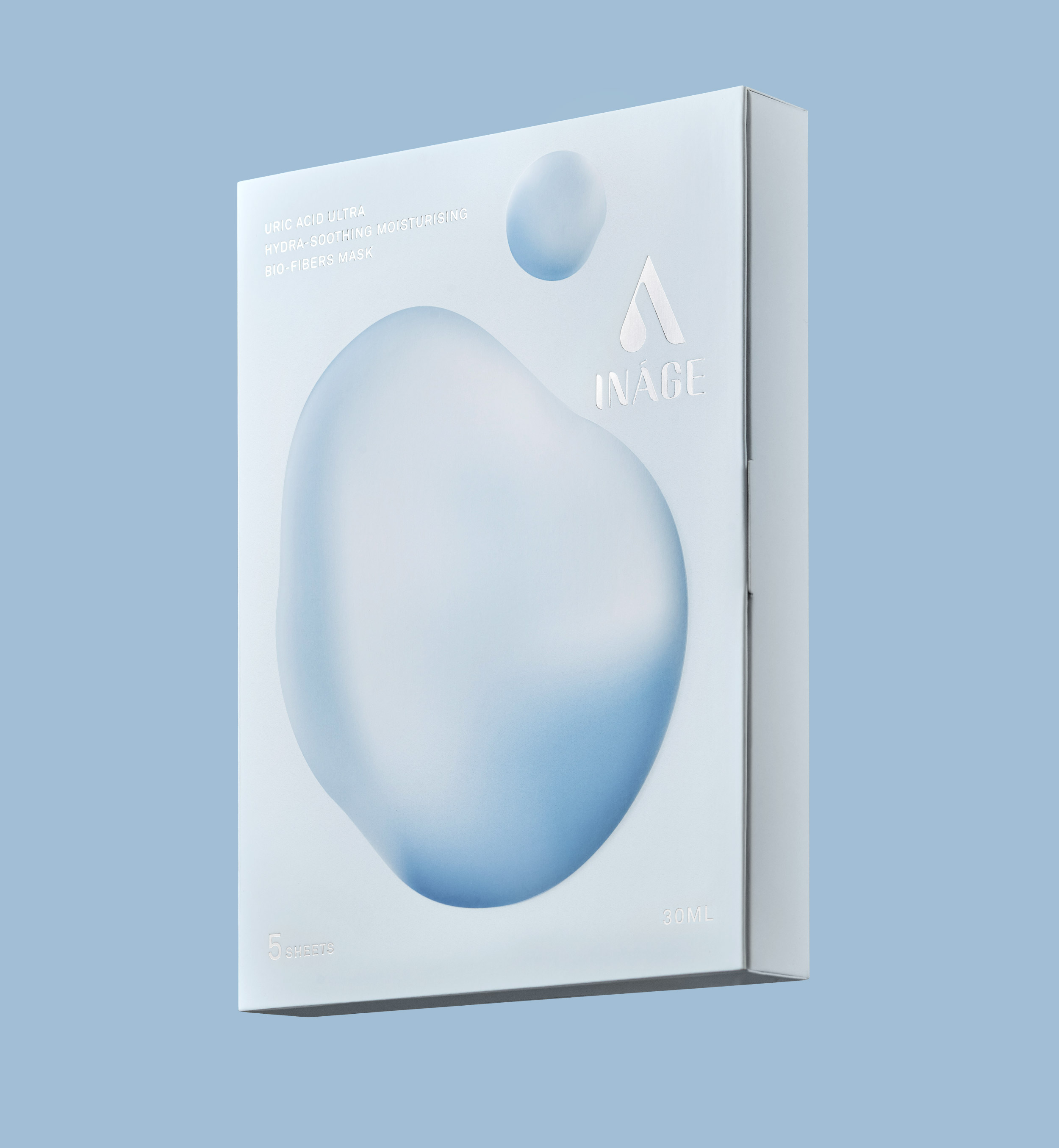
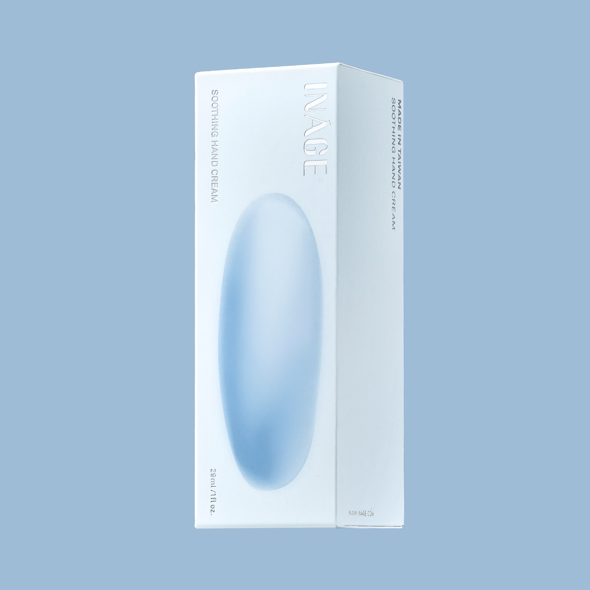
INÁGE is a Taiwanese beauty brand. Aqua is an important body substance and essential element for the human body. Most of the competitors on the market present multi-function as the selling point. On the contrary, we hope that the language of the packaging can be more direct and focused, to present "moisture" as the brand core.
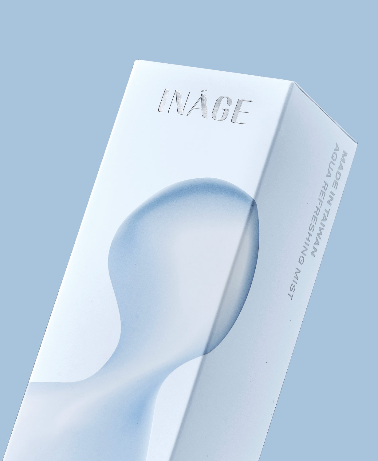
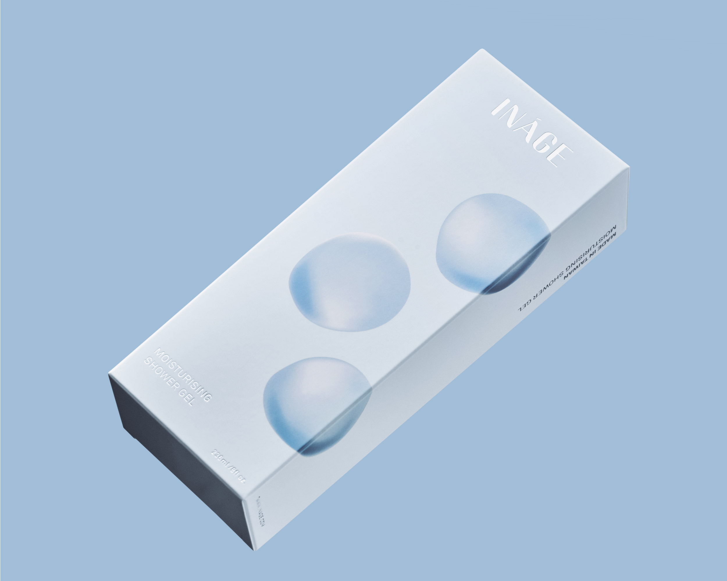
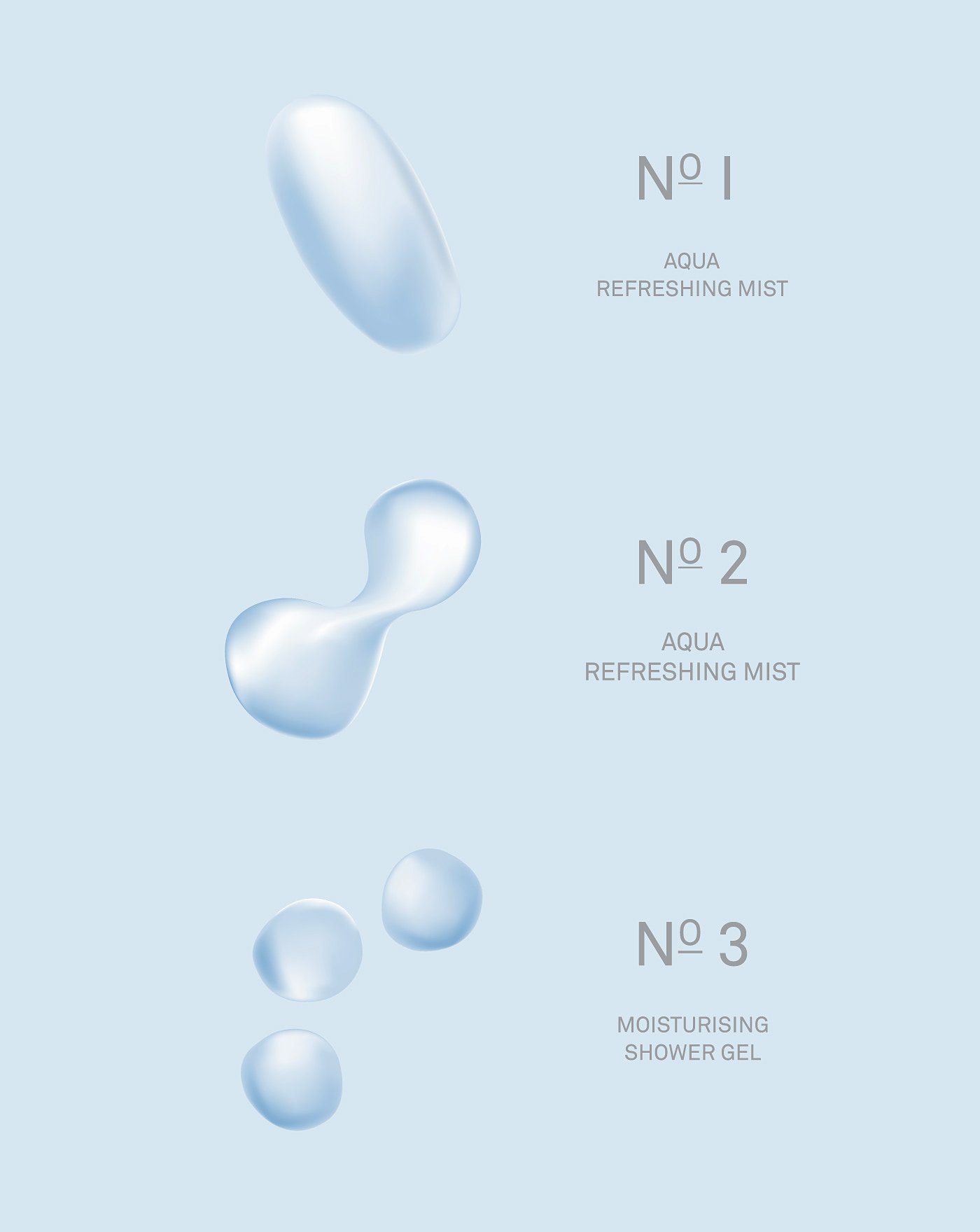
The packaging design focuses on expression of different movement, form and density of water. The collection of extendible graphics are important visual elements, which communicate with the consumers effectively for the brand message we want to convey, and reduce unnecessary and excessive interpretation of packaging.

Photography by Andrew Kan


INÁGE Branding
Type
Art Direction
Brand identity
Packaging
Photography



Photography by Andrew Kan