


FONG KEI BAKERY PACKAGING
Type
Branding
Packaging
Animation
Art Direction
Illustration
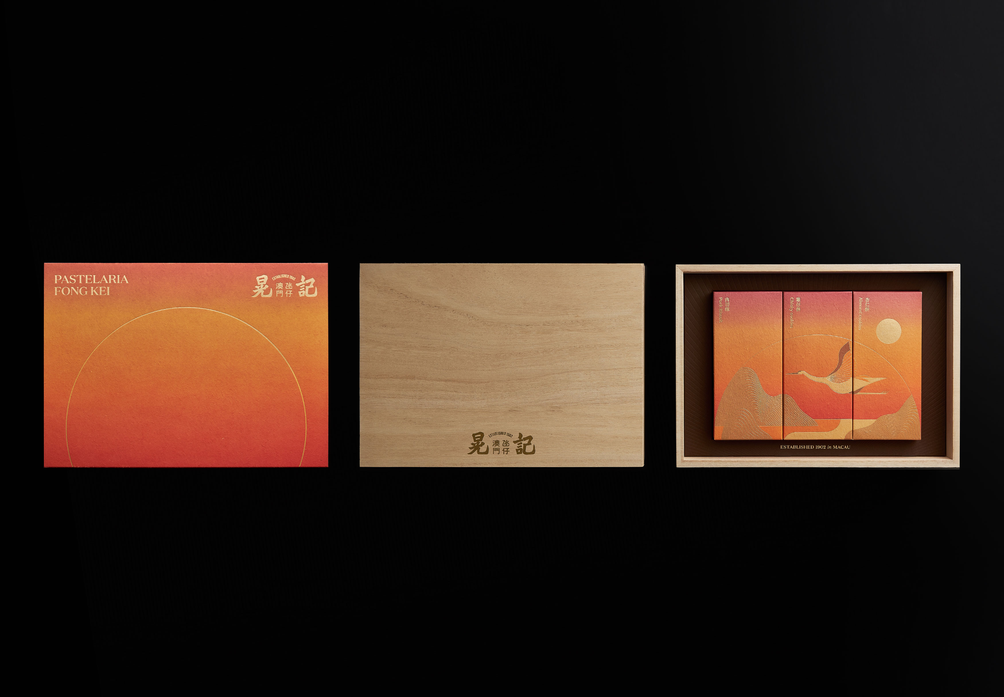
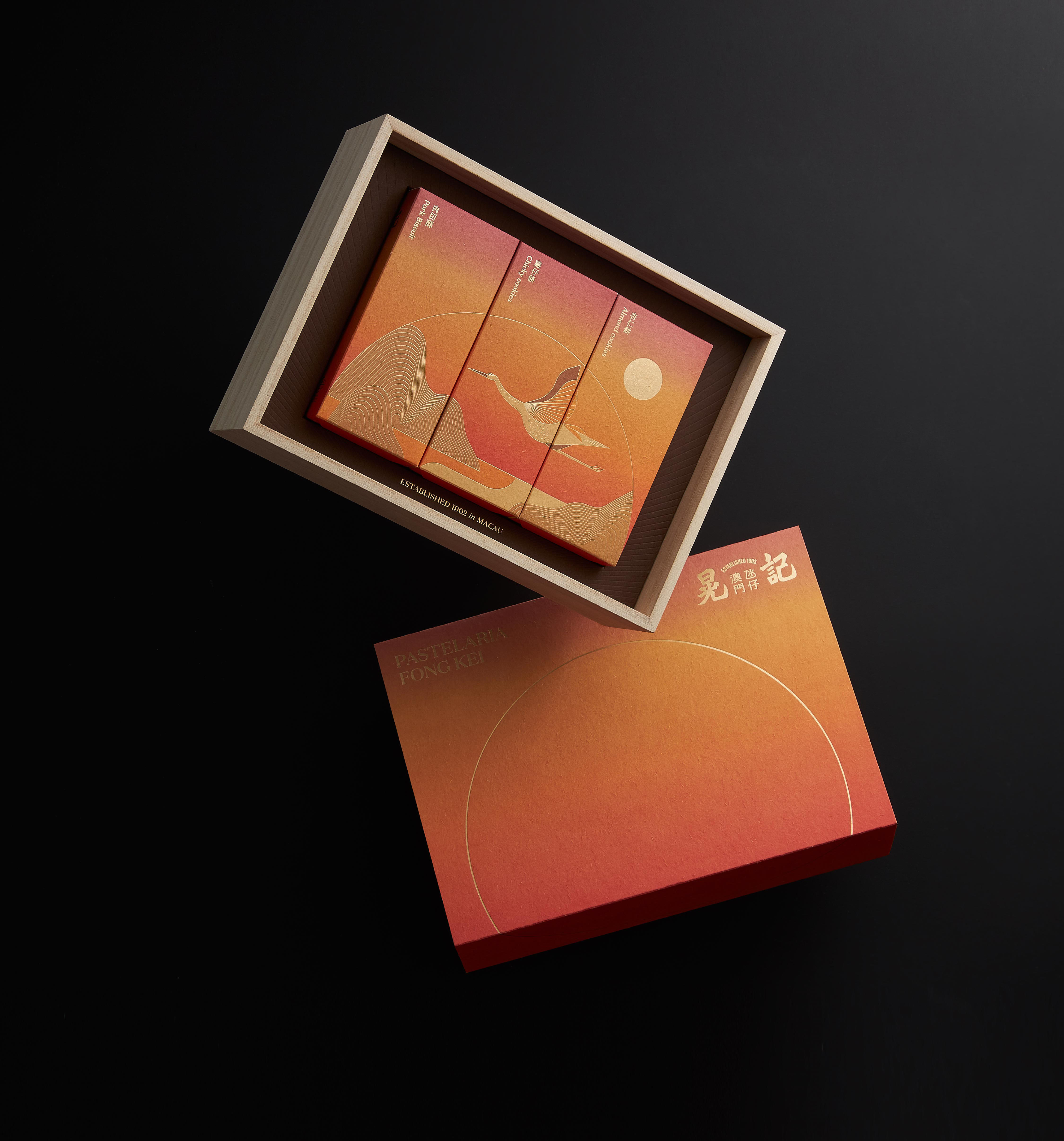
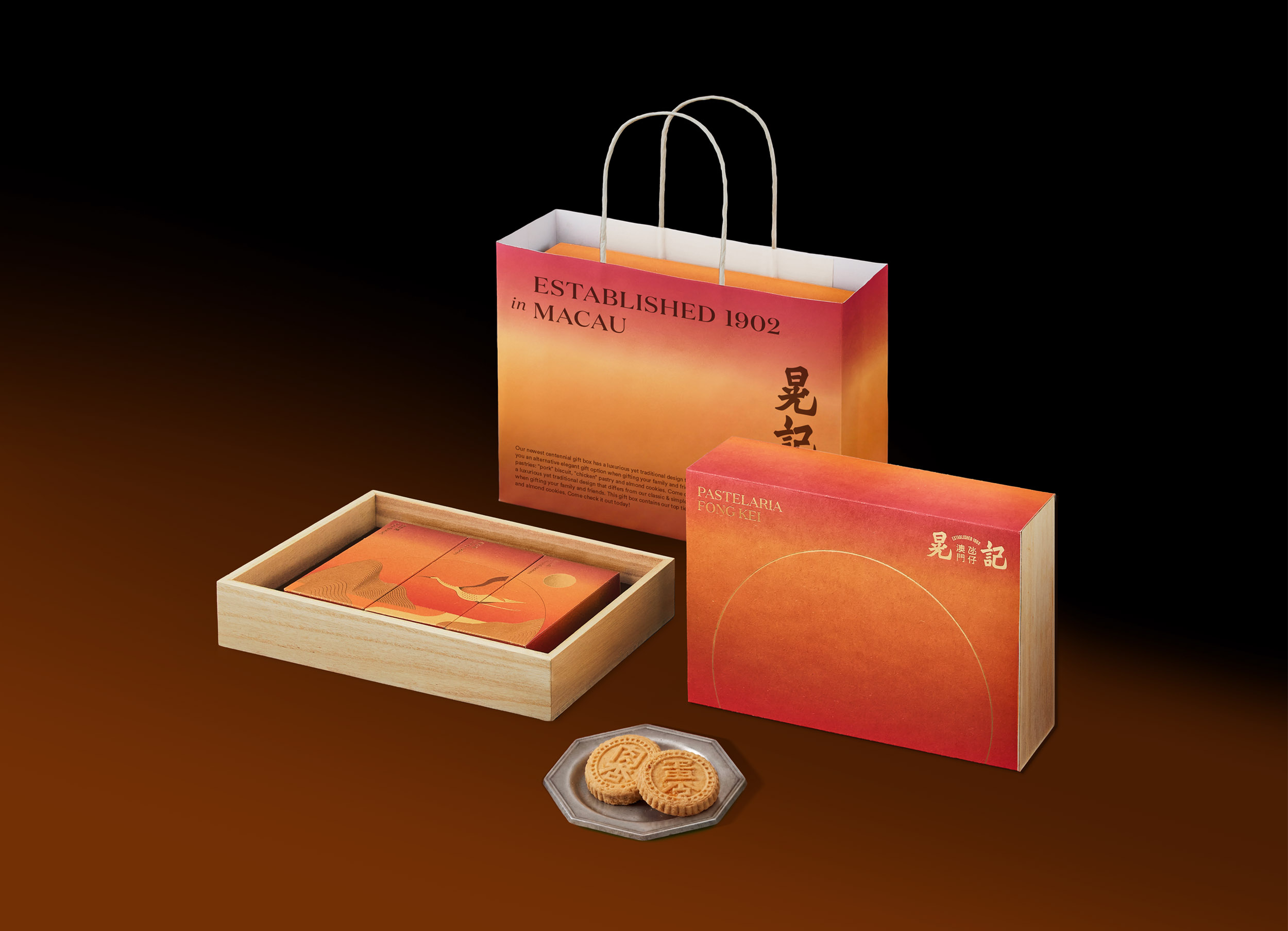
The owner of Fong Kei Bakery, a traditional bakery that has been running for over 110 years in Macao, commissioned us to design a gift box with the brand’s three signature products inside.
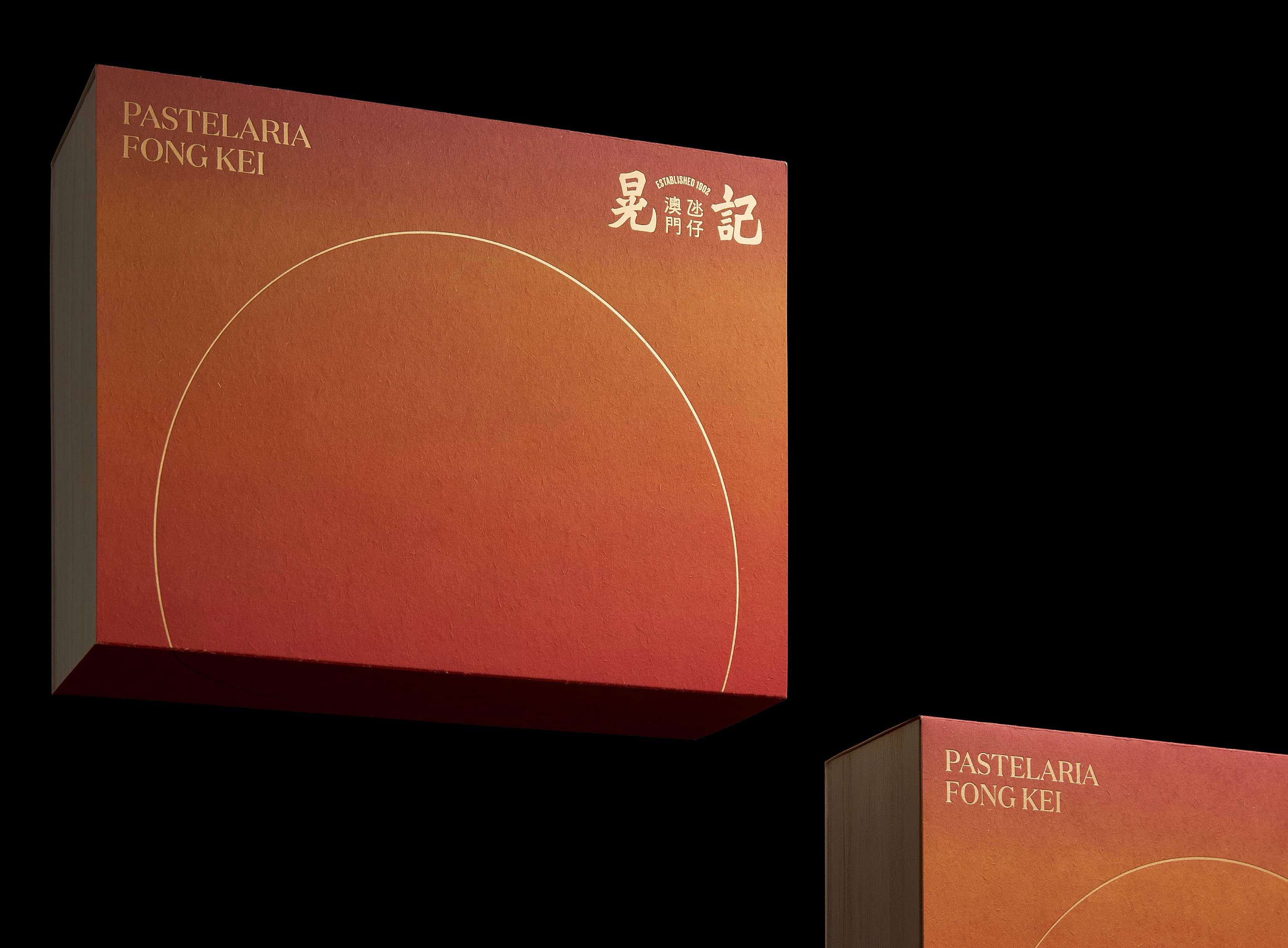
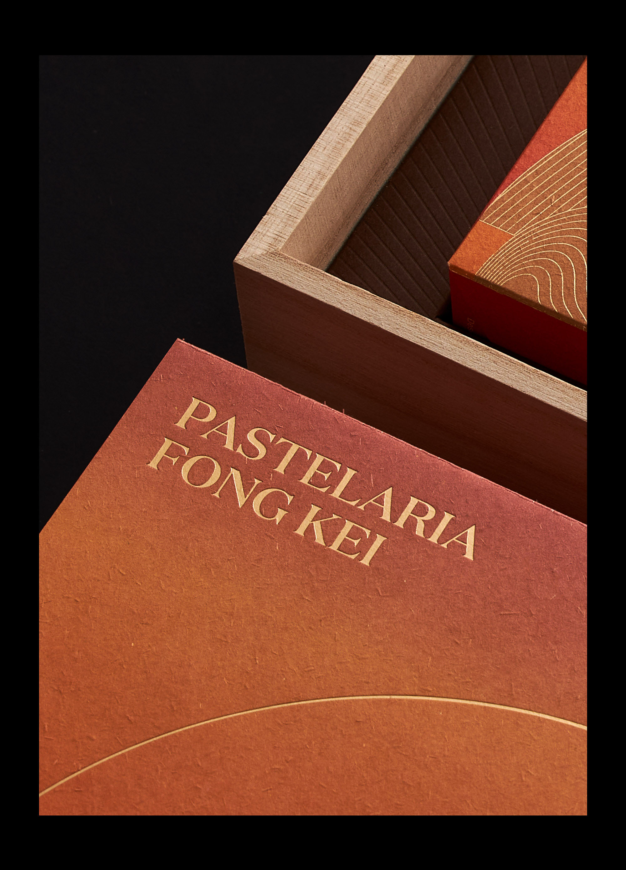
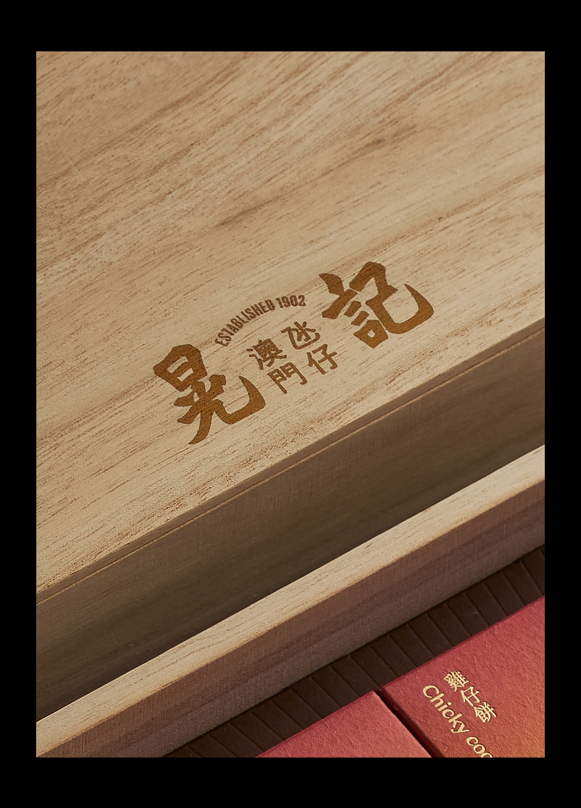
We drew inspiration from the first character of the brand’s Chinese name. It can be broken down into another two characters that mean sunlight when read together, so we adopted “sunrise” as the theme of the design. The gift box features, on its cover, a gradient background that evokes the changing color of light during sunrise and a semicircle symbolizing the ascending sun. The symbol implies an endless cycle of life and a wish that the brand will continue to shine.
我們以品牌中文名稱的「晃」字作為意念,「晃」在中文字結構由「日」與「光」組成,有「日光」的含意,因此設計以日出為概念,包裝外套上呈現日出時的光線變化以及太陽上升的景象,上升中的半圓象徵生生不息,喻意晃記餅家的光輝將會繼續下去。



Photography by Mo Chien
FONG KEI BAKERY
PACKAGING
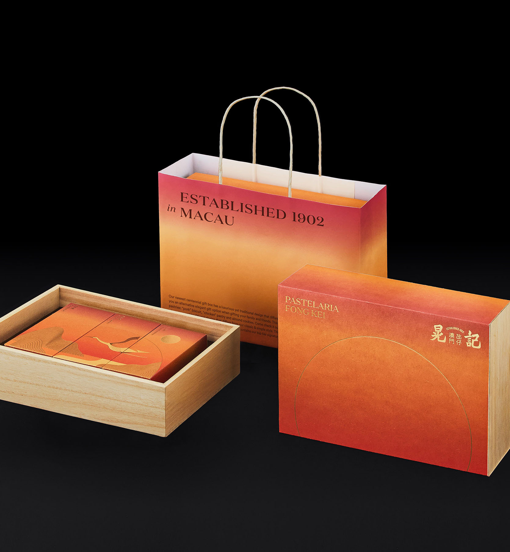
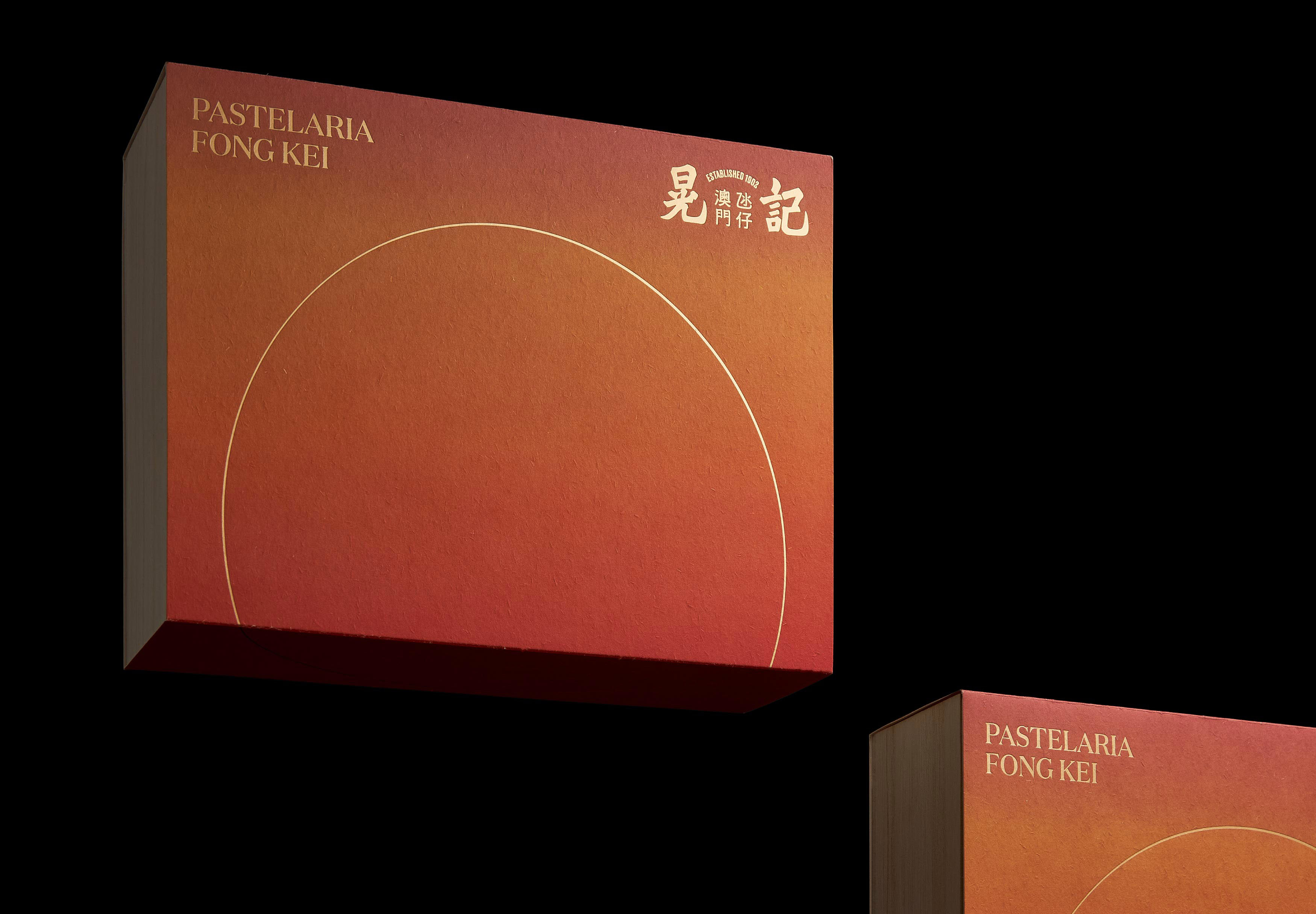
We drew inspiration from the first character of the brand’s Chinese name. It can be broken down into another two characters that mean sunlight when read together, so we adopted “sunrise” as the theme of the design. The gift box features, on its cover, a gradient background that evokes the changing color of light during sunrise and a semicircle symbolizing the ascending sun. The symbol implies an endless cycle of life and a wish that the brand will continue to shine.
我們以品牌中文名稱的「晃」字作為意念,「晃」在中文字結構由「日」與「光」組成,有「日光」的含意,因此設計以日出為概念,包裝外套上呈現日出時的光線變化以及太陽上升的景象,上升中的半圓象徵生生不息,喻意晃記餅家的光輝將會繼續下去。


Photography by Mo Chien
.